

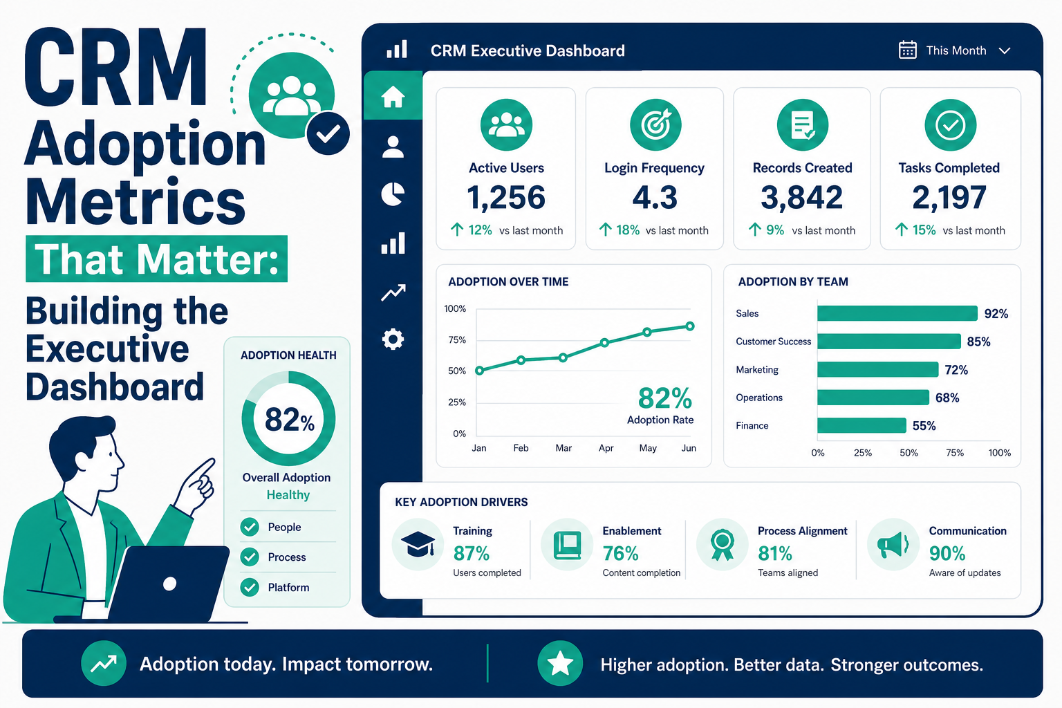
Quick answer: The CRM adoption metrics worth putting in front of executives are the ones that predict return: field completeness on key objects, pipeline hygiene (stage aging and next-step coverage), activity capture coverage, time-to-first-update on new records, and whether managers actually run their business from reports. Login counts and record volumes are vanity metrics — they measure presence, not behavior. A useful executive dashboard pairs a small set of these leading indicators with the lagging outcomes they drive, and every metric on it should have a named owner and an agreed intervention when it slips.
Most CRM adoption dashboards fail the same way: they get built once, they track logins, everyone nods at the numbers, and nothing changes. Meanwhile the forecast is still built in spreadsheets, which is the truest sign the CRM has not been adopted at all. This guide covers what to measure instead, how to build the dashboard in Salesforce or HubSpot, and what to do when a metric turns red.
Why do login counts lie about adoption?
Logins measure whether people opened the application, not whether they trusted it with anything. A rep can log in daily to look up phone numbers while keeping real deal intelligence in a notebook. A manager can be "active" without ever running a pipeline review from a report. Three failure modes make login-style metrics misleading:
- They saturate. Once logins hit a plateau, the metric stops discriminating between healthy and hollow usage — everyone looks adopted.
- They're gameable and often gamed unintentionally. Mobile apps, email sidebars, and SSO auto-logins inflate the number without any behavior change.
- They correlate with nothing executives care about. Forecast accuracy, cycle time, and win rate move with data quality and process discipline, not with session counts.
Keep logins as a floor-level alarm (a rep with zero sessions in two weeks is worth a conversation) — just never present them as evidence of adoption.
Which adoption metrics actually predict CRM ROI?
Measure the behaviors that make CRM data trustworthy, because trustworthy data is what produces return. Five metrics carry most of the weight:
- Field completeness on key objects. Pick 5–10 fields that decisions depend on — amount, close date, next step, lead source, decision-maker contact — and track the percentage of open records where they are populated. Completeness on fields nobody uses is noise; tie the list to real reports and forecasts.
- Pipeline hygiene: stage aging and next-step coverage. What share of open deals have sat in one stage beyond your typical cycle time? What share have a future-dated next step? Stale stages and empty next steps are the earliest warnings that the pipeline is fiction.
- Activity capture coverage. The percentage of open opportunities (or active deals) with a logged activity in the last 14 days, and the share of customer-facing emails and meetings landing in the CRM — ideally through automated capture rather than manual logging, so the metric measures engagement rather than typing discipline.
- Time-to-first-update. How long between a record being created or assigned and its first meaningful touch — a logged call on a new lead, an edit on a new opportunity. Slow first updates predict records that will never be maintained.
- Report and dashboard usage by managers. If frontline managers run pipeline reviews from CRM dashboards, reps keep data current because their work is visible. If managers export to spreadsheets, no amount of rep-level nagging will fix adoption. This is the single most diagnostic metric on the list.
What's the difference between leading and lagging indicators here?
Executives ultimately care about lagging outcomes — forecast accuracy, win rate, cycle time, retention. The adoption metrics above are the leading indicators that move them, usually a quarter or two ahead. The dashboard should show both layers so the causal story is visible.
| Leading indicator (adoption behavior) | Lagging outcome it predicts | Healthy direction |
|---|---|---|
| Field completeness on key objects | Forecast accuracy; segmentation and reporting quality | Rising, then stable at a high plateau |
| Stage aging / next-step coverage | Cycle time; late-quarter slippage | Aging down, coverage up |
| Activity capture coverage | Win rate; at-risk account detection | Rising with automation, not manual effort |
| Time-to-first-update | Lead conversion; speed-to-lead outcomes | Falling |
| Manager report/dashboard usage | Sustained adoption of everything above | Weekly cadence, every team |
Resist the urge to put fifteen metrics on the executive view. Five leading indicators, three lagging outcomes, trended over time, beats an encyclopedia nobody reads.
How do you build this dashboard in Salesforce and HubSpot?
In Salesforce:
- Field completeness: formula fields that score each record's key fields, rolled up in reports; flag gaps directly on the page layout so reps see the score they're being measured on.
- Stage aging: reports on days-in-stage (opportunity field history or a stage-entry date field), filtered against your cycle-time thresholds.
- Activity coverage: reports on opportunities without recent activity — strengthened considerably when activity logging is automated via Einstein Activity Capture rather than left to manual entry.
- Manager usage: review dashboard subscription and usage patterns, and make the adoption dashboard itself the artifact managers present from in pipeline reviews.
In HubSpot:
- Field completeness: required properties at stage transitions plus custom reports on property fill rates for open deals.
- Pipeline hygiene: deal reports on time-in-stage and deals with no scheduled next activity; HubSpot's default deal properties make both straightforward.
- Activity coverage: reports on last-activity dates across active deals and companies, with email and meeting logging automated through inbox and calendar connections.
- Manager usage: shared dashboards per team, presented live in weekly reviews rather than exported.
In both platforms, trend every metric. A single-week snapshot invites debate about the number; a twelve-week trend line makes the story undeniable.
What do you do when a metric slips?
A dashboard without an intervention playbook is decoration. For each metric, agree in advance which of three levers to pull:
- Enablement — when the behavior is unclear or hard. Short, role-specific refreshers beat all-hands retraining; pair them with manager talk tracks so the message repeats in reviews.
- Process fix — when the process itself creates the gap. If reps skip fields because the stage definitions are ambiguous, or aging balloons because a stage bundles three distinct steps, fix the design rather than coaching harder.
- Automation — when humans are being asked to do machine work. Auto-capture activities, derive fields from integrations, default intelligently, and validate at the moment of entry. Every field you automate is a field that can no longer slip.
A practical cadence: the metric owner triages within a week, chooses a lever, and the executive dashboard notes the intervention date — so next quarter you can see whether it worked. Over time this turns the dashboard from a scorecard into a management system.
Frequently asked questions
How many metrics belong on the executive version of the dashboard?
Five to eight, trended. Executives need enough to see the causal chain from behavior to outcome and no more. Detailed operational views — per-rep completeness, per-team aging — belong on manager dashboards one level down, linked from the executive view for drill-in.
Should adoption metrics be tied to compensation?
Carefully, if at all. Paying directly for data entry invites box-checking that corrupts the very data you are trying to trust. A better pattern: make CRM data the only recognized source for forecast and pipeline reviews, so accurate records become the path to visibility and credit rather than a separately compensated chore.
How often should the dashboard be reviewed?
Managers should work from it weekly in pipeline reviews; executives should review the trended version monthly, with a deeper quarterly look that pairs adoption trends against lagging outcomes. Metrics reviewed less than monthly decay into decoration.
What's a realistic timeline to see adoption metrics improve?
Behavioral metrics like next-step coverage and time-to-first-update typically respond within a few weeks of a focused intervention, because they measure current activity. Field completeness on the existing record base moves slower — expect a quarter of steady remediation. Lagging outcomes like forecast accuracy generally take one to two quarters after the leading indicators stabilize.
Do these metrics work the same in Salesforce and HubSpot?
The metrics are platform-agnostic; only the plumbing differs. Salesforce offers deeper customization for scoring and field-history-based aging, while HubSpot gets you to a serviceable version faster with required properties and default reports. In both cases the constraint is organizational discipline, not tooling.
How Vantage Point helps
Vantage Point builds adoption measurement into every CRM engagement — defining the metrics that fit your sales motion, building the executive and manager dashboards in Salesforce or HubSpot, and automating away the data entry that causes most slippage through our workflow automation and process optimization practice. For teams that want ongoing stewardship, our managed services and ongoing support keep the dashboard honest quarter after quarter. Senior consultants only — no junior handoffs; the experts you meet are the experts who deliver.