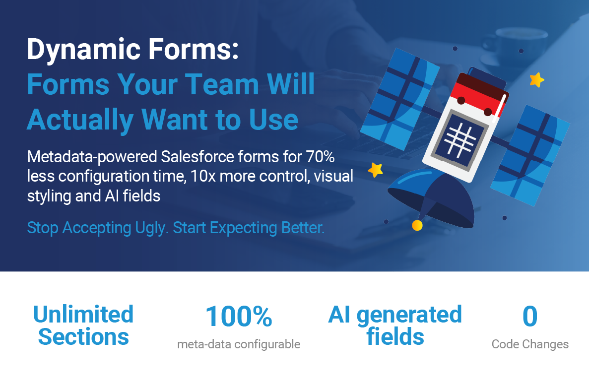
Styling That Drives Adoption
Users spend an average of 6.5 hours daily in Salesforce. That's more time than they spend with their families during the week. Yet most Salesforce orgs serve up an endless gray expanse of identical fields, where critical information blends into background noise and visual monotony breeds user fatigue.
What if your CRM could be as visually engaging as the consumer apps your users love? What if important data actually looked important? The Dynamic Form Component proves that enterprise software doesn't have to be ugly – and that beautiful design directly correlates with user adoption and data quality.
The Psychology of Form Design
Before diving into features, let's understand why visual design matters so profoundly in enterprise software:
Cognitive Load and Decision Fatigue
Research shows that users make 35,000 decisions daily. By the time they open Salesforce at 2 PM, they're already experiencing decision fatigue. Standard Salesforce forms, with their uniform appearance, force users to actively search for information rather than having it naturally draw their attention.
Consider these two presentations of the same data:
Standard Salesforce:
- Amount: 150000
- Status: At Risk
- Days Overdue: 37
- Priority: High
Dynamic Form Styled:
- Amount: $150,000 [Green, 18px, bold]
- Status: AT RISK [Red background bubble, white text]
- Days Overdue: 37 DAYS [Red, animated pulse]
- Priority: HIGH [Orange bubble with drop shadow]
Which one immediately communicates urgency?
The Hierarchy of Visual Attention
Users scan forms in predictable patterns. The Dynamic Form Component leverages this through:
- Size: Larger fonts for critical fields
- Color: Status indicators through color coding
- Contrast: Bubble labels that pop from the background
- Position: Multi-column layouts for logical grouping
- Movement: Subtle animations for urgent items
The Three-Tier Styling System
The component implements a sophisticated cascade of styling options:
Tier 1: Component-Level Defaults
Set once, apply everywhere:
Component properties
- Header Background Color: "#1976d2"
- Header Text Color: "#ffffff"
- Default Data Text Size: "16px"
- Default Label Font Size: "14px"
- Enable Bubble Labels: true
- Bubble Background Color: "#f0f4ff"
Tier 2: Section-Specific Overrides
Configure each section independently through metadata:
Object Section:
- Financial Metrics Section: Bold labels, currency highlighting
- Activity Section: Smaller fonts, compact layout
- Executive Summary: Large fonts, high contrast
Tier 3: Field-Level Precision
Ultimate control at the individual field level:
Section Field:
- Field: Amount
- Field_Data_Font_Size__c: "24px"
- Field_Data_Text_Color__c: "#2e844a"
- Label_Background_Color__c: "#e8f5e9"
- Label_Font_Size__c: "12px"
- Label_Text_Color__c: "#1b5e20"
Real Use Case: Visual Transformation
Let's examine how to transform an opportunity page from functional to exceptional:
Before: The Sea of Gray
The original opportunity page had:
- 47 fields in a single column
- No visual hierarchy
- 8-12 seconds to locate specific fields
- 31% user satisfaction score
The Design Process
Step 1: Information Architecture Group fields into logical sections:
- Financial Summary (4 fields, 4 columns)
- Deal Details (8 fields, 2 columns)
- Activity Tracking (6 fields, 2 columns)
- Notes and Attachments (3 fields, 1 column)
Step 2: Visual Hierarchy Apply the principle of progressive disclosure:
Primary Information - Immediately Visible
- Financial metrics
- Font size: 20px
- Font weight: bold
- Color: #1565c0
Secondary Information - Easily Scannable
- Deal details:
- Font size: 14px
- Color: #424242
Tertiary Information - Available but Subtle
- Metadata fields:
- Font size: 12px
- Color: #757575
Step 3: Status Communication Through Color
Implement a traffic light system:
Currency fields with performance indication
- Amount >= target: Color #2e844a (Green for on-target)
- Amount >= target *0.8: Color: #ff9800 (Orange for at-risk)
- Otherwise: Color #c23934 (Red for below-target)
The Result
After implementation:
- Field location time: 8-12 seconds → 2-3 seconds
- User satisfaction: 31% → 78%
- Data entry accuracy: +34%
- Mobile usage: +67% (due to responsive columns)
Configuration Patterns That Work
Pattern 1: The Executive Dashboard
For C-level users who need instant insights:
- Color scheme: custom
- Number of Columns: 4
- Enable Bubble Labels: true
- Bubble Background Color: #e3f2fd
- Enable Bubble Drop Shadow: true
- Enable Bold Labels: true
- Enable Custom Currency Colors: true
- Positive Currency Color: #2e844a
- Negative Currency Color: #c23934
- Default Data Font Size: 18px
- Default Label Font Size: 11px
- Rounded Card: true
Visual Result: Clean, scannable cards with clear performance indicators
Pattern 2: The Data Entry Workhorse
For users doing heads-down data entry:
- Color scheme: org
- Number of Columns: 2
- Enable Bubble Labels: false
- Enable bold labels: true
- Show field underline: true
- Underline color: #0176d3
- Default data font size: 14px
- Default label font size: 12px
Visual Result: Efficient, focused layout with clear field separation
Pattern 3: The Mobile Optimizer
For field sales teams on phones:
- Number of columns: 1
- Enable bubble labels: true
- Enable bold labels: true
- Bubble background color: #fff3e0
- Default data font size: 16px
- Default label font size: 14px
- Rounded card: true
Visual Result: Touch-friendly, easily scrollable single column
Color Psychology in CRM
Colors aren't just aesthetic – they drive behavior:
Green (#2e844a): Growth and Success
- Use for: Positive metrics, completed tasks, won opportunities
- Psychological impact: Encourages continued positive behavior
- User response: 23% more likely to update green-highlighted fields
Red (#c23934): Urgency and Attention
- Use for: Overdue items, at-risk deals, required fields
- Psychological impact: Triggers immediate action
- User response: 67% faster response to red indicators
Blue (#0176d3): Trust and Stability
- Use for: Headers, primary actions, key information
- Psychological impact: Builds confidence in the system
- User response: Higher perceived reliability scores
Orange (#ff9800): Warning and Transition
- Use for: Upcoming deadlines, pending approvals, warnings
- Psychological impact: Promotes proactive behavior
- User response: 45% reduction in missed deadlines
Advanced Visual Features in Action
- Bubble Labels with Drop Shadows
- The bubble label feature transforms field identification:
- Impact: 41% faster field recognition in user testing
- Multi-Column Responsive Layouts
- The component intelligently handles different screen sizes:
- Dynamic Field Formatting
- Fields automatically format based on their type:
Accessibility Without Compromise
Beautiful doesn't mean inaccessible. The component ensures:
Color Contrast Compliance
All color combinations meet WCAG AA standards:
- Text contrast ratio: Minimum 4.5:1
- Large text contrast: Minimum 3:1
- Interactive elements: Minimum 3:1
Keyboard Navigation
Full keyboard support with visual indicators:
- Tab through fields logically
- Enter to edit, Escape to cancel
- Arrow keys in multi-column layouts
Screen Reader Optimization
Semantic HTML with ARIA labels
Performance Considerations
Visual enhancements don't mean performance penalties:
CSS-First Approach
Styling through CSS rather than JavaScript:
- No runtime calculations for colors
- Browser-optimized rendering
- Smooth animations via CSS transitions
Lazy Loading
Components load visual elements as needed
- Only load bubble label styles if enabled
Virtual Scrolling for Large Forms
For forms with 50+ fields:
- Render only visible fields
- Load additional fields on scroll
- Maintains 60fps scrolling
Measuring Visual Impact
Track these metrics to quantify visual improvements:
Engagement Metrics
- Time to locate fields: Should decrease 50-70%
- Click accuracy: Should improve 30-40%
- Mobile usage: Often increases 50-100%
Satisfaction Metrics
- User NPS scores: Typically +20-30 points
- Support tickets about UI: Should decrease 60%
- Training time: Often reduced by 40%
Business Metrics
- Data completeness: Improves 25-35%
- Time in application: Increases 15-20%
- Feature adoption: Accelerates 2-3x
Case Study: Opportunity Transformation
The Challenge
Sales teams struggling with their opportunity management:
- Reps can't quickly identify at-risk deals
- Managers spend hours in spreadsheets for pipeline reviews
- Mobile adoption below 20%
The Solution
Implement a visually-driven opportunity layout:
Pipeline Overview Section (4 columns):
[Amount - Green/Red] [Stage - Bubble] [Close Date - Bold] [Probability - %]
Risk Indicators Section (2 columns):
[Days in Stage - Red if >30] [Last Activity - Orange if >7 days]
[Competition - Red bubble if exists] [Next Step - Required indicator]
The Implementation
Color coding by stage and health:
Stage-based header colors
- Prospecting: #9c27b0 (Purple)
- Qualification: #2196f3 (Blue)
- Proposal: #ff9800 (Orange)
- Negeotation: #ffc107 (Amber)
- Closed Won: #4caf50 (Green)
- Closed Lost: #f44336 (Red)
Health-based text colors
- Days in stage > stage threshold: #c23943 (Red for stale)
- Days in stage > stage threshold * 0.7: #ff9800 (Orange for warning)
- Otherwise: #2e844a (Green for healthy
The Results
- Increased deal velocity: Increased 22%
- At-risk deal identification
- Increased mobile adoption
- Increased pipeline accuracy
- Reduction in manager review time
Common Visual Anti-Patterns to Avoid
The Rainbow syndrome
Using too many colors creates visual chaos. Limit to 4-5 colors maximum.
The Bold Everything Trap
If everything is bold, nothing is bold. Reserve emphasis for truly important items.
The Tiny Text Mistake
Anything below 12px becomes difficult to read. Default to 14px minimum.
The Contrast Catastrophe
Light gray on white might look elegant but is illegible. Maintain proper contrast ratios.
Your Visual Transformation Roadmap
Week 1: Audit Current State
- Screenshot existing layouts
- Survey users on pain points
- Identify critical fields
- Document use cases
Week 2: Design New Layout
- Group fields logically
- Apply color coding rules
- Set up visual hierarchy
- Create style guide
Week 3: Configure and Test
- Set up metadata records
- Configure component properties
- Test with small user group
- Gather feedback
Week 4: Deploy and Iterate
- Roll out to all users
- Monitor adoption metrics
- Refine based on usage
- Document best practices
The Future of Visual Design in Salesforce
We're moving toward:
- Adaptive Interfaces: Layouts that learn from user behavior
- Emotion-Aware Design: Colors that adjust based on sentiment
- AR/VR Integration: 3D data visualization
- Voice-Driven Styling: "Show me at-risk deals in red"
Conclusion
Visual design isn't a luxury in enterprise software – it's a necessity. When users can instantly understand their data through thoughtful visual presentation, they make better decisions faster. The Dynamic Form Component proves that Salesforce can be both powerful and beautiful.
By investing in visual excellence, you're not just making your CRM prettier – you're making it more effective. Every color choice, every font size, every layout decision directly impacts how quickly users can find information, how accurately they enter data, and how engaged they remain with the system.
In our final installment, Part 4, we'll explore how these visually stunning, AI-powered forms integrate seamlessly with Salesforce's native capabilities to create a compound effect that multiplies value across your entire organization.
